Curt Carlson
co-editor
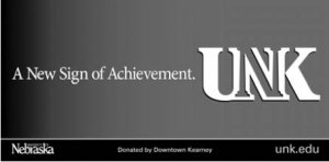
 The official launch of a new UNK campus academic icon is underway. Based upon the best known campus identity, “UNK,” the new icon creatively incorporates an architectural image of columns on either side of an enhanced “N,” portraying UNK as a distinguished member of the nation’s higher education community, as well as being a university that strongly and proudly claims Nebraska as its home state and Kearney its home city.
“We’re certainly excited about the new campus identity symbol for the University of Nebraska at Kearney,” said Mark Hartman, chair of the Department of Art & Art History. “For years we have encouraged the UNK community to develop a primary symbol that would clearly identify and distinguish the Kearney campus.”
Continued prominent use of the familiar University of Nebraska wordmark/logo as an integral component of UNK’s branding and identity, along with the new campus icon, celebrates the significance of UNK’s membership as a full partner campus of the NU System.
The columns of the “N” image in the new icon are open at the top, intending to portray the clear, blue skies above the campus, so characteristic of the Great Plains in which UNK is situated. The new icon is also designed to be used where appropriate in a smooth integration with the athletic Loper icon, either by combining the new “UNK” icon within the Loper image itself, or by a tasteful grouping of the two icons into one comprehensive identity for the university.
According to Chancellor Doug Kristensen, the new icon and branding system “will help the university to present its local campus brand consistently to its many audiences, while at the same time reinforcing UNK’s positioning as a strong component of the state’s major university system, the University of Nebraska.”
The new icon itself is only a part of a comprehensive graphic standards system for UNK that includes a palate of compatible colors, including the school’s traditional blue and gold, and a family of typestyles to help create a consistent look and feel for all university publications and marketing materials. The graphic standards system, along with downloadable images, will be posted soon on a Web site accessible to campus departments.
The new icon and graphic standards were developed by Malcolm Grear Designers of Providence, Rhode Island, a firm selected by the 30-member University Relations Advisory Council (URAC) after considering proposalsfrom several state and national firms who responded to UNK’s RFP. The Grear team conducted focus groups on campus, interviewed dozens of faculty, students and administrators, examined prior marketing research, and combed through literally hundreds of pieces of university print and Web marketing materials. More than 150 participants from every sector of the campus were included in the Grear’s research, which informed the creative process. Ultimately, the new icon was endorsed by the NU Identity Committee, comprised of representatives of each of the four NU campuses and chaired by Sharon Stephan, NU’s assistant vice president for Communications and Marketing.
A display of graphic design work from the Grear studio was on display in the Walker Art Gallery for more than a month last fall while the research and creative work were being undertaken.
“Malcolm Grear and his studio are well-known and respected on a national level in the graphic design field,” said Rick Schuessler, professor of art and art history. “Over the last 35 years, this firm has created hundreds of identity marks for important entities across the U.S., including many universities such as Vanderbilt.
“One need only visit the Malcolm Grear Web site and see their list of clients to begin to appreciate the caliber of this firm. The UNK symbol is consistent with the quality of work that one would expect from Malcolm Grear Designers. The firm has done its job to provide a solid visual identity. From this point on, the success of the symbol will depend upon how well it is implemented by the university,” he said.
Campus use of the new icon will be monitored and assisted by the Department of Publications and Creative Services, and its new director, Randy Mattley. The integration of the new icon on the UNK Web site will be directed and monitored by Nate Blazek, lead Web/multimedia developer. Updating campus marketing and communications materials will take place gradually, as funds are available to replace dwindling supplies of existing materials. The new “look” of the campus will show up most dramatically in a whole new set of Admissions marketing materials for the fall recruiting period, and will also be in evidence in a new design for UNK’s Web site, also targeted for rollout in the fall.
The new icon and associated images will be trademarked and may be used only with permission of the director of Publications and Creative Services. Its application on apparel, cups and other items of merchandise must also be by permission, because all university-branded merchandise is licensed. Vendors who wish to produce merchandise with the UNK logo, name and/or images must apply for licensing authority with the university (Office of Business and Finance), and designs must be approved before production or sale of any item.
Vice Chancellor for University Relations Curt Carlson, who has guided this project, is currently making presentations to campus groups as a part of the rollout of the new graphic system.